Dine Corner Lite WordPress Theme Documentation
← Back to Dine Corner Pro documentation
Welcome to the Dine Corner Lite documentation. This free ThemesCave theme is built for catering companies, event planners, cafes, and fine-dining hosts. This guide covers installation, Customizer setup, homepage hero & Events we Cater, header/footer, layouts, mobile & responsive design, and compatibility with WooCommerce, multilingual plugins, and Elementor. For help, see the Support section.
Open the full theme guide: Dine Corner Pro documentation | ← Back to Pro
1. Theme Installation
a. Through WordPress Dashboard
- Go to Appearance » Themes and click Add New.
- Click Upload Theme, browse to dine-corner-lite.zip, and click Install Now.
- After installation, click Activate.
- Open Appearance » Customize to configure Site Identity, Header Image, Events we Cater, Footer, and Layout.
dine-corner-lite folder to /wp-content/themes/ via FTP, then activate it under Appearance » Themes.b. Reading Settings (Homepage)
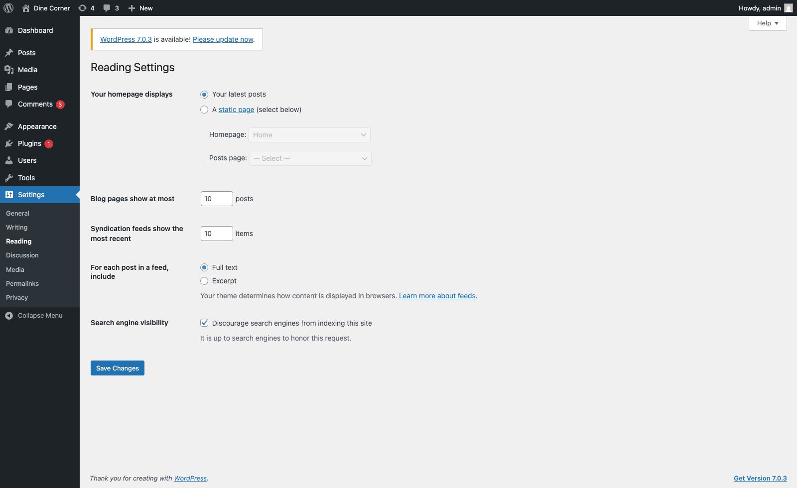
Dine Corner Lite works with either Your latest posts or a static front page.
- Go to Settings » Reading.
- For a marketing homepage: choose A static page and pick your Front Page (optional Posts page for the blog).
- Or keep Your latest posts — the hero banner and Events we Cater section still appear above the post list.
2. Homepage Setup
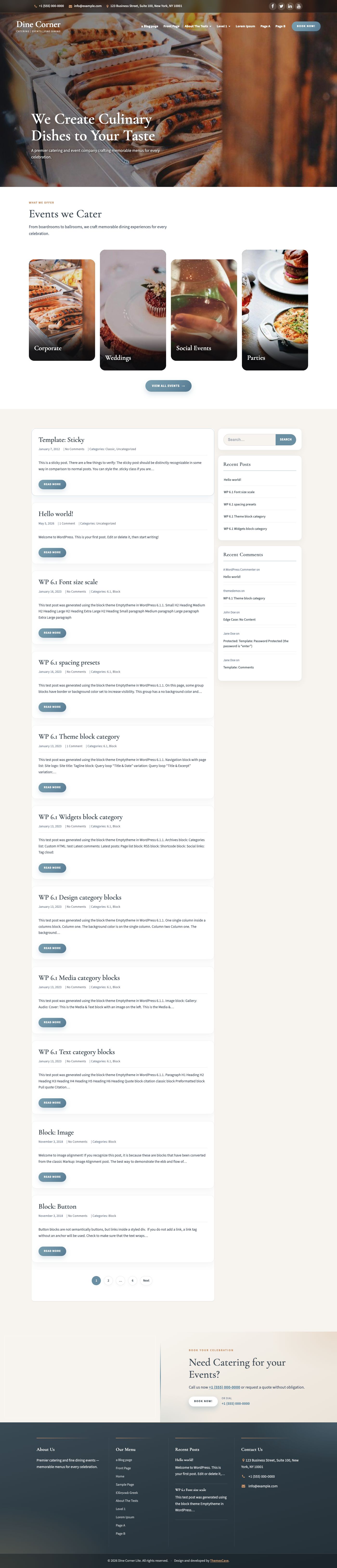
The Lite homepage focuses on conversion-ready catering content:
- Transparent header over the hero (phone, email, social, logo, menu, BOOK NOW)
- Full-bleed hero banner with heading and subheading
- Events we Cater — four portrait cards (show/hide in Customizer)
- Latest blog posts grid
- Footer Catering CTA — Need Catering / BOOK NOW band (show/hide in Customizer)
- Footer catering columns + copyright
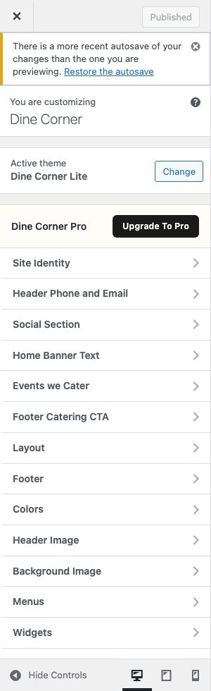
All theme options live under Appearance » Customize with live preview.
3. The Header
The header includes a top contact strip, social icons, logo/site title, primary navigation, and a BOOK NOW button. On the homepage the header sits over the hero; on inner pages it uses a solid bar.
a. Contact info & Book Now
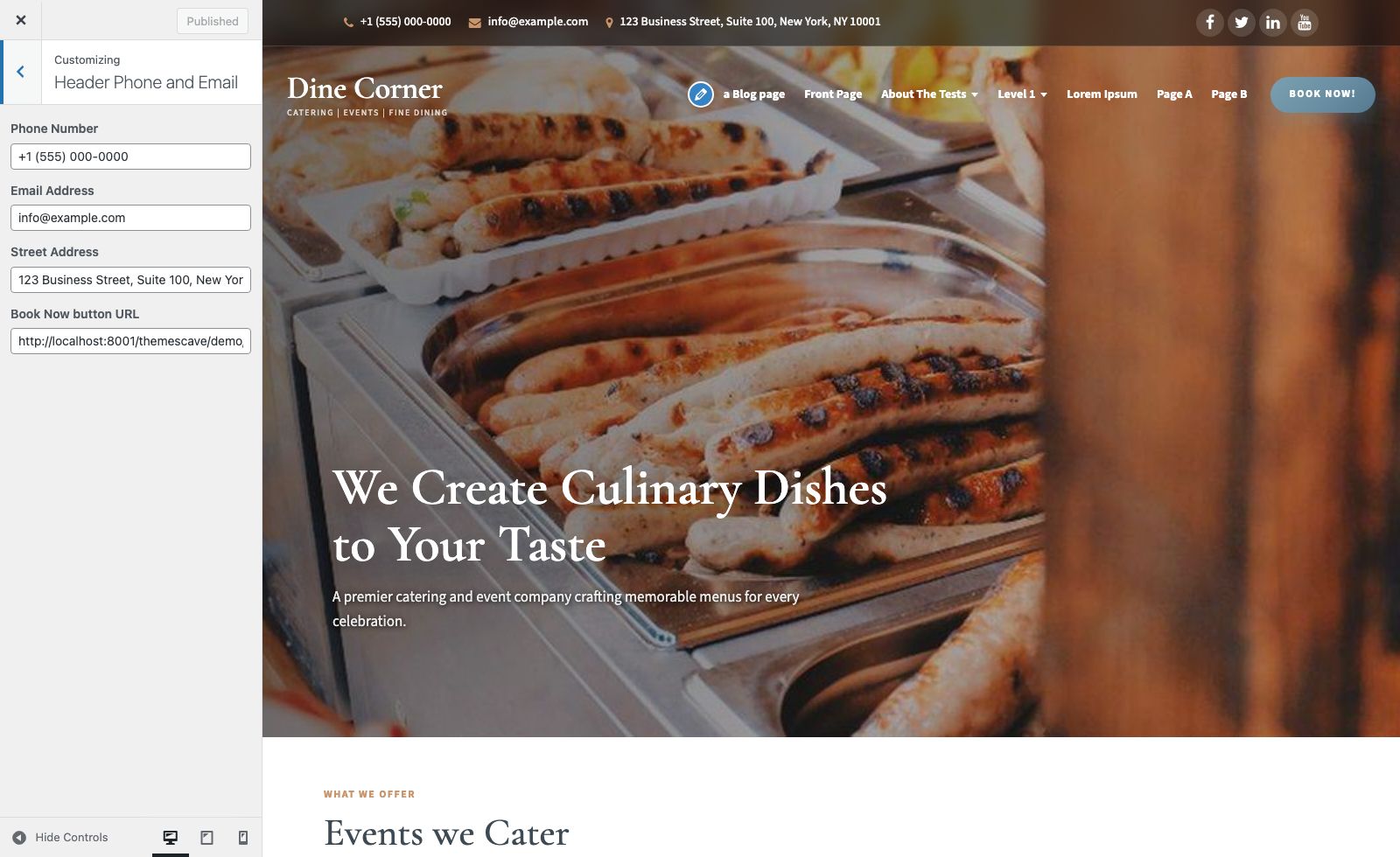
Go to Appearance » Customize » Header Phone and Email:
- Phone Number
- Email Address
- Street Address (top strip)
- Book Now button URL
b. Social links
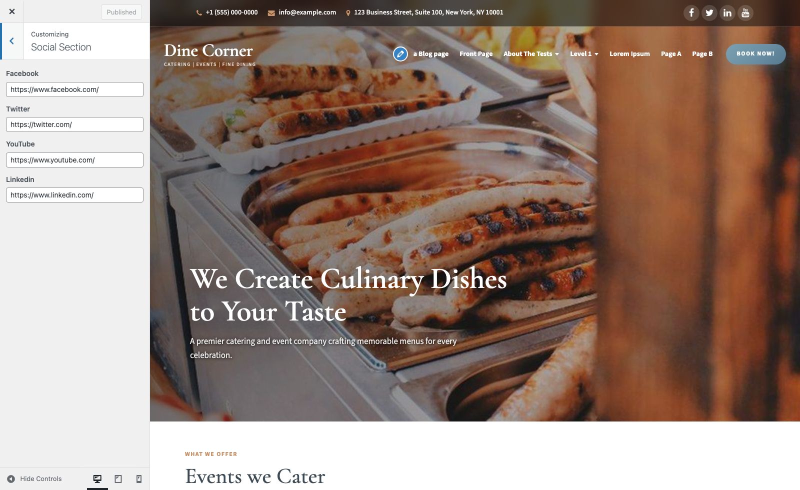
Go to Appearance » Customize » Social Section and add Facebook, Twitter, YouTube, and LinkedIn URLs. Leave a field empty to hide that icon.
c. Site name / logo
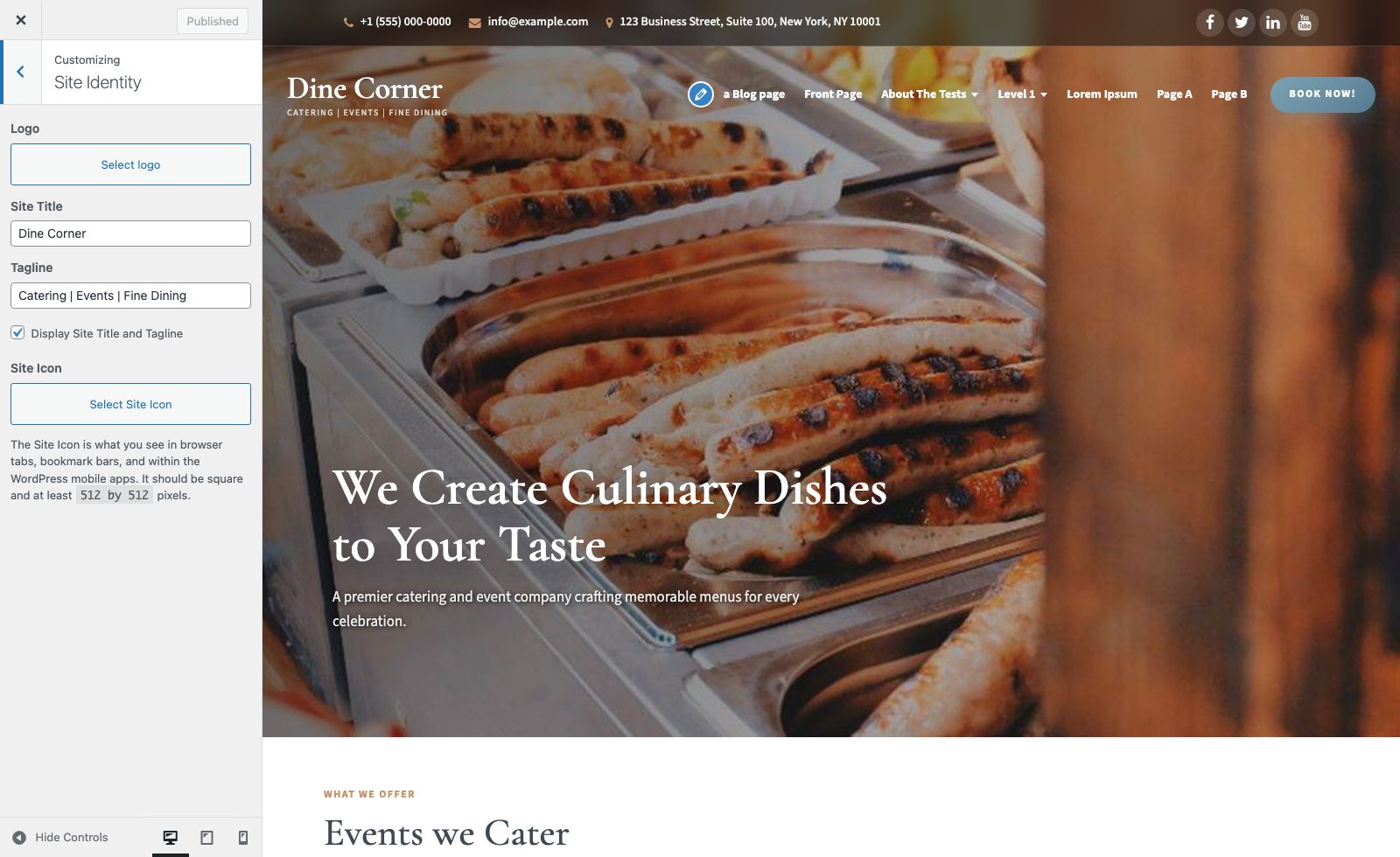
Change site title and tagline under Appearance » Customize » Site Identity.
Upload a logo under Site Identity » Logo. Recommended logo size: about 270 × 90 px (or similar wide logo).
d. Setting the menu
- Create pages under Pages » Add New.
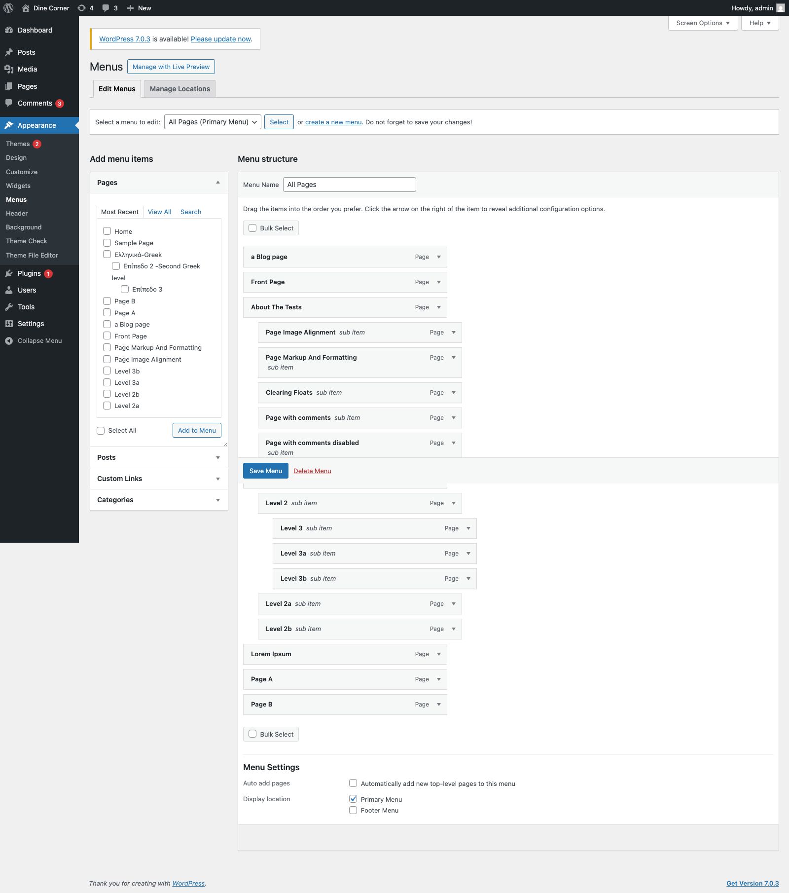
- Go to Appearance » Menus, create a menu, add pages, and assign it to Primary Menu.
- Optionally create a second menu and assign it to Footer Menu.
- Drag items to nest dropdowns under parent items (multi-level menus are supported).

4. Homepage Banner
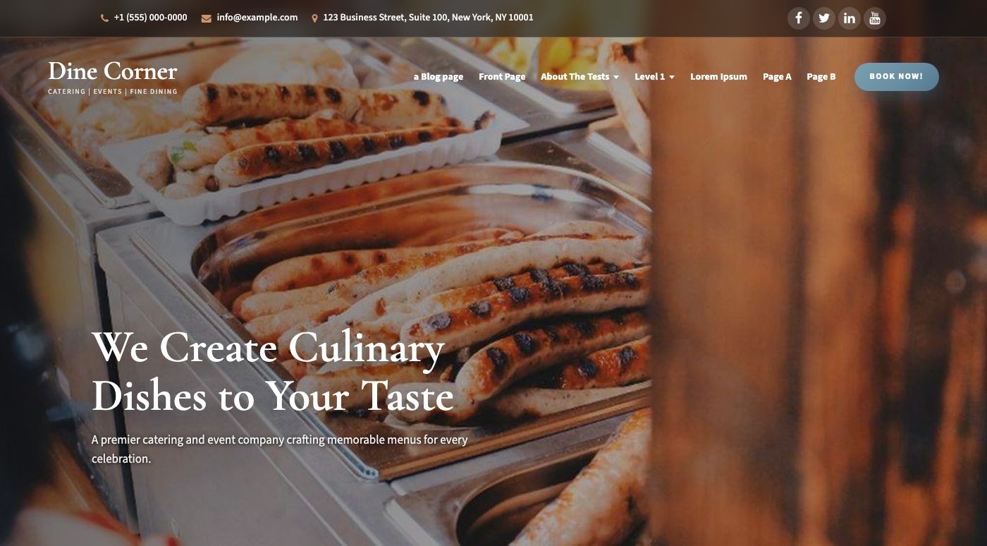
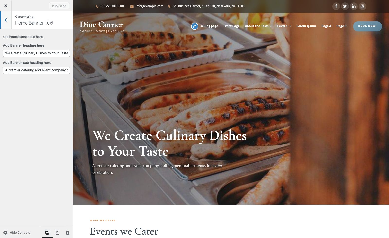
The hero uses the WordPress Header Image plus Customizer text:
- Appearance » Customize » Header Image — upload or crop the hero photo (recommended 1800 × 900 px or larger).
- Appearance » Customize » Home Banner Text — set Banner heading and Banner sub heading.
5. Inner Page Banner
Inner pages and posts show a title banner below the header. The theme ships with a default catering image; you can replace the visual feel via your page featured image where supported by layout.

6. Events we Cater
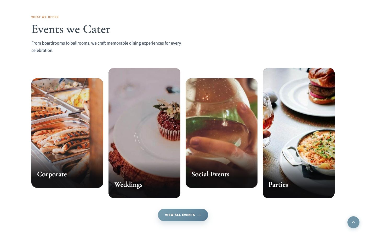
Four portrait event cards appear after the homepage banner (Corporate, Weddings, Social Events, Parties by default).
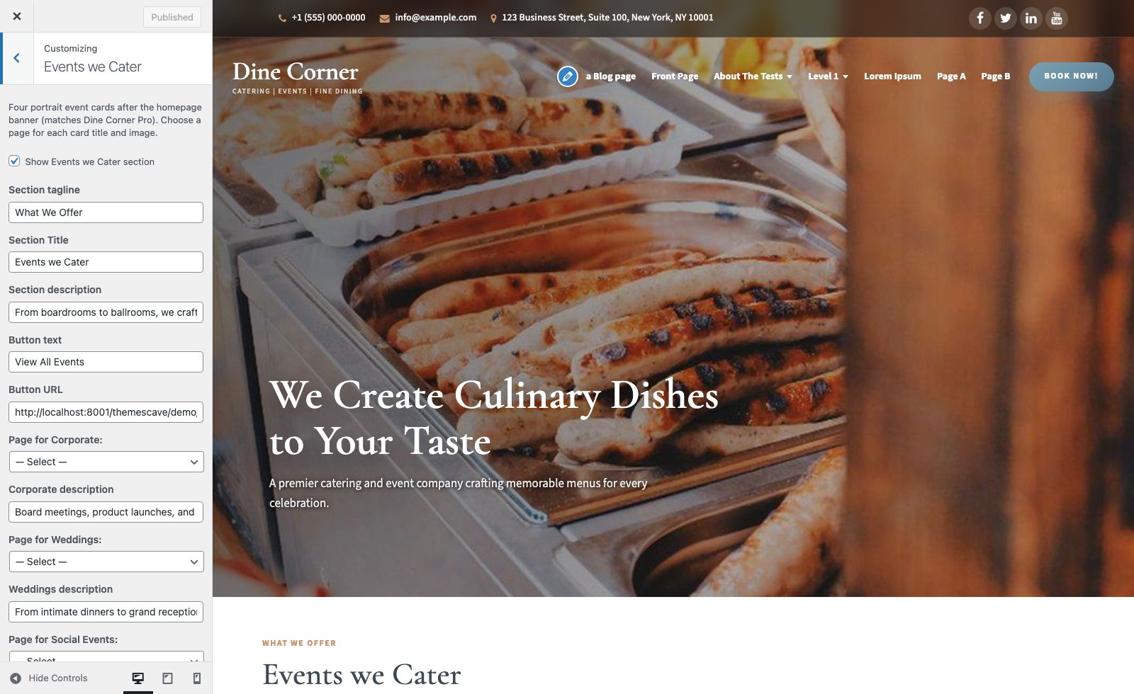
Configure at Appearance » Customize » Events we Cater:
- Show Events we Cater — checkbox to show or hide the whole section
- Section tagline, title, and description
- Button text and Button URL (e.g. “View All Events”)
- For each card: choose a Page (title + featured image) and an optional description
7. Footer Catering CTA
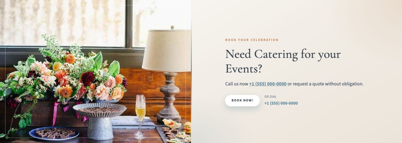
This is the “Need Catering for your Events?” band with the left image and BOOK NOW button, directly above the dark footer columns.
Where to find it in the Customizer
Open Appearance » Customize. In the left menu you will see Footer Catering CTA (between Events we Cater and Layout):
All settings
Go to Appearance » Customize » Footer Catering CTA:
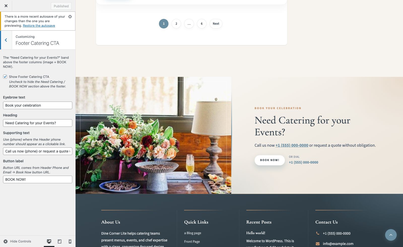
| Setting | What it does |
|---|---|
| Show Footer Catering CTA | Checkbox — show or hide the whole Need Catering / BOOK NOW section |
| Eyebrow text | Small label above the heading (default: Book your celebration) |
| Heading | Main title (default: Need Catering for your Events?) |
| Supporting text | Line under the heading. Use {phone} to insert the Header phone as a clickable link |
| Button label | BOOK NOW button text |
- Button URL — set under Header Phone and Email » Book Now button URL
- Phone number (in supporting text and “Or dial”) — set under Header Phone and Email » Phone Number
8. Blog / Latest Posts
On the front page, recent posts appear in a card grid after Events we Cater. On the blog index, archive, and search pages, the same layout styles apply.
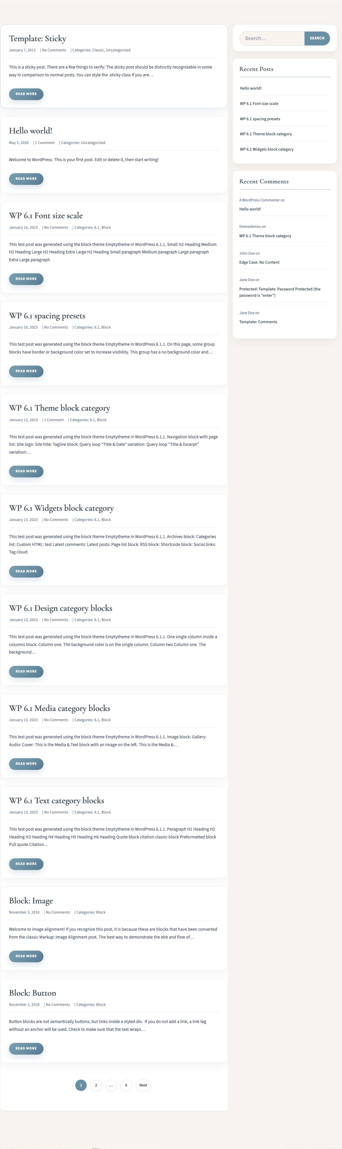
- Write posts under Posts » Add New and set a Featured Image (~640 × 426 px or larger).
- Sidebar widgets: Appearance » Widgets » Blog Sidebar.
9. Footer
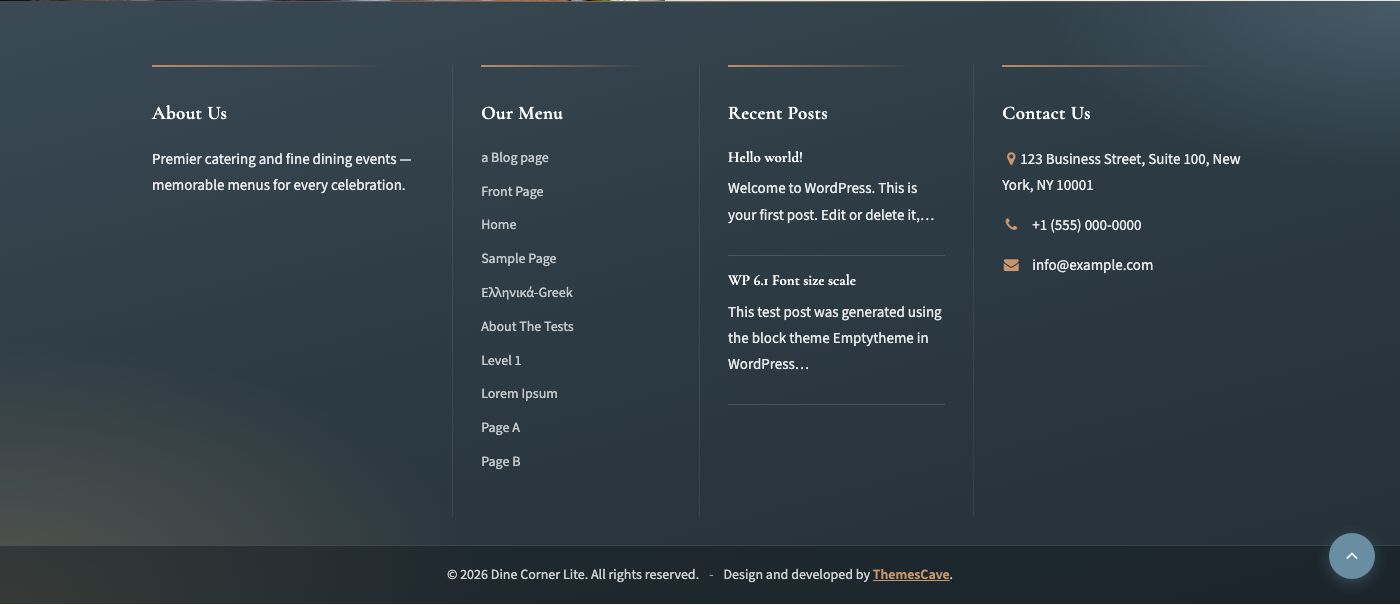
Go to Appearance » Customize » Footer (columns + copyright — not the catering CTA band):
- Show / hide the bottom footer (columns + copyright)
- About heading & description
- Menu column title, Recent posts title, Contact column title
- Contact address (phone & email reuse Header Phone and Email)
- Copyright and “Design and developed” credit
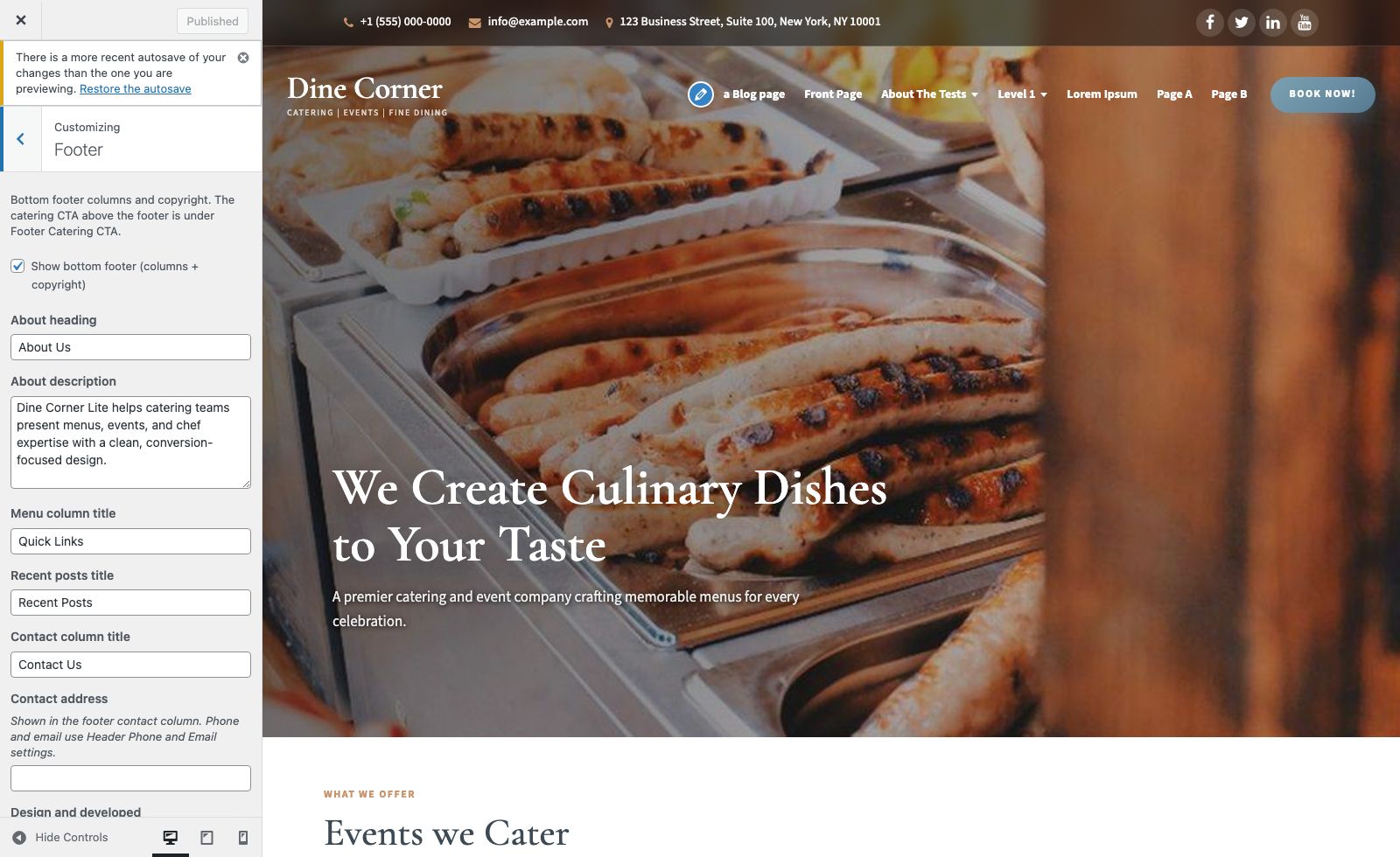
You can also place widgets in Footer Widget 1–4 under Appearance » Widgets. Assign a menu to the Footer Menu location for the Quick Links column.
10. Page Templates & Layouts
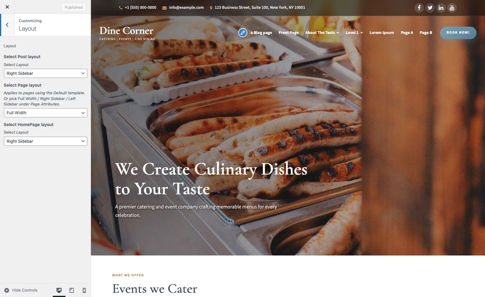
Global defaults: Appearance » Customize » Layout
- Post layout — Right Sidebar / Left Sidebar / Full Width
- Page layout — applies to pages using the Default template
- Homepage layout — for the posts index / home content area
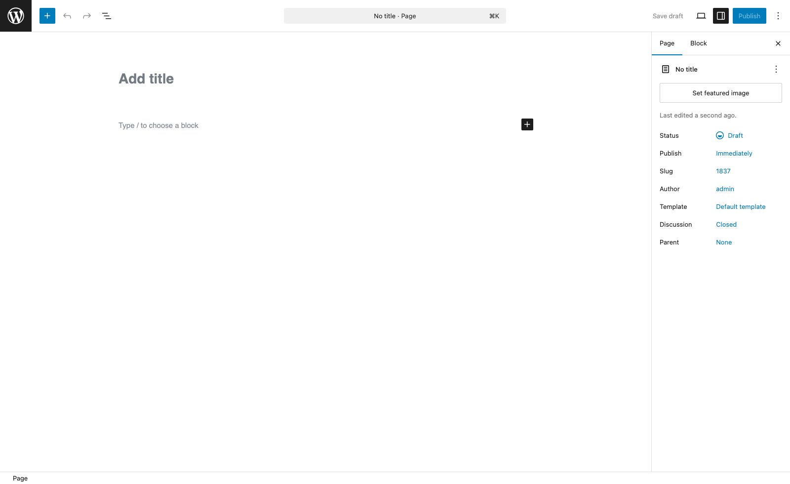
Per-page templates (edit a page » Page Attributes » Template):
- Default / Full Width — no sidebar (comment form stays a readable width)
- Right Sidebar — content + sidebar on the right
- Left Sidebar — sidebar on the left + content
11. Recommended Image Sizes
| Area | Where to upload | Recommended size |
|---|---|---|
| Homepage hero | Customizer » Header Image | 1800 × 900 px |
| Inner page banner | Theme default / page featured image | 1800 × 500 px |
| Site logo | Customizer » Site Identity » Logo | 270 × 90 px |
| Events we Cater cards | Page Featured Image (per card page) | 600 × 800 px (portrait) |
| Footer Catering CTA image | Theme default (pantry/plates/footer-cta.jpg) | 900 × 700 px (or larger) |
| Blog / post cards | Post Featured Image | 640 × 426 px (or larger) |
12. Mobile & Responsive Design
Dine Corner Lite is fully responsive. Layouts use fluid containers, flexible grids, and a touch-friendly mobile drawer so the header, hero, Events cards, blog, and footer stay readable on phones, tablets, and desktops.
a. Breakpoints
| Viewport | Typical devices | Behavior |
|---|---|---|
| Desktop — 981px and above | Laptops, large tablets (landscape) | Horizontal primary menu, multi-column Events & blog grids, full header strip |
| Tablet — 768px to 980px | iPad, small laptops | Hamburger menu drawer, stacked header, 2-column card grids |
| Mobile — 767px and below | Phones | Single-column layouts, shorter hero, full-width buttons, compact footer columns |
b. Mobile navigation
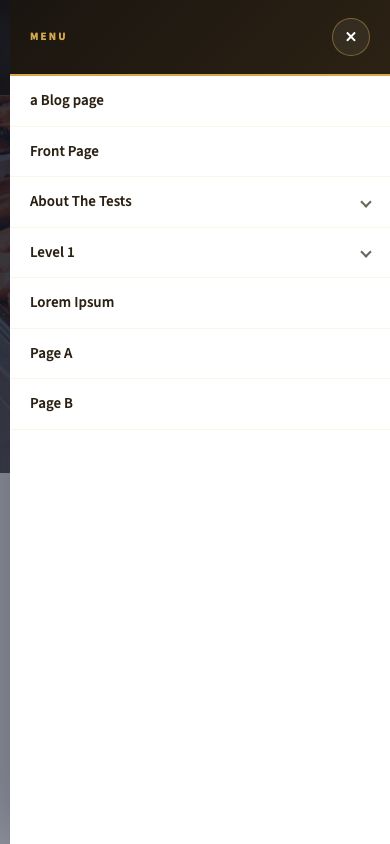
Below 981px width, the primary menu collapses into a hamburger Menu toggle (with BOOK NOW nearby). Opening it slides in a full-height drawer with:
- Menu title and close (×) control
- Expandable parent items for dropdowns (tap the parent to open nested links)
- Overlay tap or close button to dismiss
Responsive navigation is powered by pantry/scripts/toggle.js and styles in pro-layout.css / pro-match.css (max-width: 980px).
c. Homepage on mobile

- Hero height reduces for smaller screens while heading and subheading remain readable
- Events we Cater cards stack into a single column
- Blog cards stack full width
- Footer CTA and columns stack vertically
d. Inner pages on mobile

- Solid header with logo + Menu toggle
- Inner banner title scales down
- Sidebar layouts stack (content then sidebar, or sidebar then content)
Responsive Features
- Fluid containers — content width scales with the viewport
- Flexible images — media never overflows
- Touch-friendly controls — larger tap targets on the mobile menu and buttons
- Logged-in admin bar — mobile header offset accounts for the WordPress admin bar
- WooCommerce shop — product grids and forms adapt on narrow screens
Core responsive rules load from pantry/styles/responsive.css, pro-layout.css, and pro-match.css automatically — no extra plugins required.
13. Compatibility — Multilingual, WooCommerce & Elementor
Multilingual / translation-ready
- Text domain:
dine-corner-lite - Theme strings use WordPress gettext (
__(),esc_html__(), etc.) - Works with WPML, Polylang, TranslatePress, Weglot, and Loco Translate
WooCommerce
- Declares
woocommercesupport plus product gallery zoom / lightbox / slider - Includes
woocommerce.phpwrapper andpantry/styles/woocommerce.css - Shop layouts follow the theme’s responsive container
Install and activate WooCommerce, then style products with Featured Images and standard WooCommerce settings.
Elementor
- Uses standard WordPress markup and works with Elementor Free / Pro
- Build landing pages with Elementor while keeping the theme header/footer, or use full-width templates as needed
14. Upgrade to Dine Corner Pro
Lite covers the essentials for a catering site. Dine Corner Pro adds dish listings, chefs, testimonials, cafe stories, more homepage sections, shortcodes, one-click demo import, and deeper Customizer controls.
- Open the full guide: Dine Corner Pro documentation
- In the Customizer, open the Dine Corner Pro / Upgrade To Pro section
- Or visit: https://www.themescave.com/themes/wordpress-theme-dine-corner-pro/
15. Support
← Back to Dine Corner Pro documentation